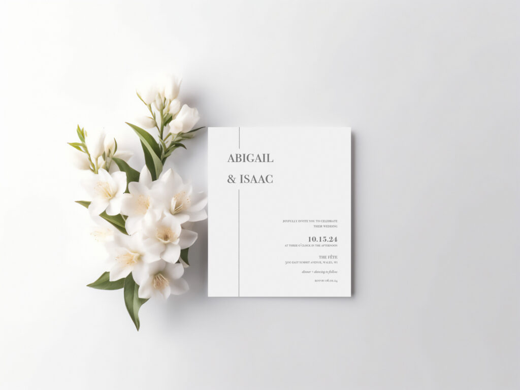
This project focused on using proximity and alignment principles to create an invitation for an event. There were color, photo, and type restrictions for this project, so creating this invitation took careful thought and consideration. I chose to create a wedding invitation for a couple of my closest friends. I wanted to use a simple, elegant typeface to communicate well who the couple is, in addition to the elegant, white wedding barn venue. The couple I created this invitation for is very simple, but they also have a sweet elegance to them. The typeface used and the simple line best communicates who they are to their invitees. I also utilized variations of the same typeface within the invitation to communicate different pieces of the event information, as well as using different sizes of text. The couple’s names are the largest piece of text because they are the centerpiece of the invitation. In regards to all the other pieces of event information, I chose the sizes of the text based on how important they were in correspondence with one another.

