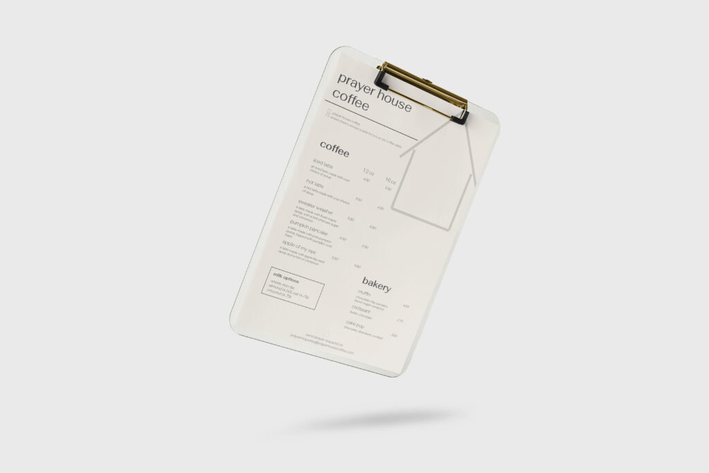
The objective of this project was to create a menu for a restaurant while utilizing repetition and contrast principles. I chose to create a menu based on my dream coffee shop, Prayer House Coffee. This coffee shop is a faith-based shop focused on cultivating community within the church and sharing the love of Jesus with those who do not yet know Him. The simple message of this coffee shop is, “Prayer House Coffee, where there’s always a seat for you at our coffee table.” In order to communicate this simple message, I aimed to create graphics to match it. I created the chair graphic to match the slogan and the house to match the name of the coffee shop. The message and mission of the shop are simple, just like the house and chair graphics. The typeface is simple and modern, matching the vision I have for the inside design of the shop and the overall message. Also regarding the typeface, I made the “coffee” and “bakery” headings larger to communicate their importance compared to the information listed below. I also created smaller text with a different variation of the typeface for the prayer requests and slogan to emphasize that those pieces of text are not menu items. Overall, I used repetition to emphasize the headers and main information consistently throughout the menu, with more specific information following. This menu emphasizes simplicity to communicate the simple Gospel to each person who walks into Prayer House Coffee.

