Fox River Christian Church
This section showcases the work I did for Fox River Christian Church’s Instagram page as a summer intern.
Before Vs After
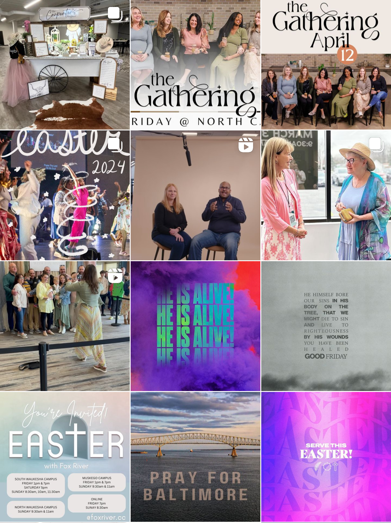
This is a comparison between what the Fox River Christian Church social media page looked like before and after I began working on it. I wanted to unify the colors more and incorporate more unique content that was personal to Fox River.
Before
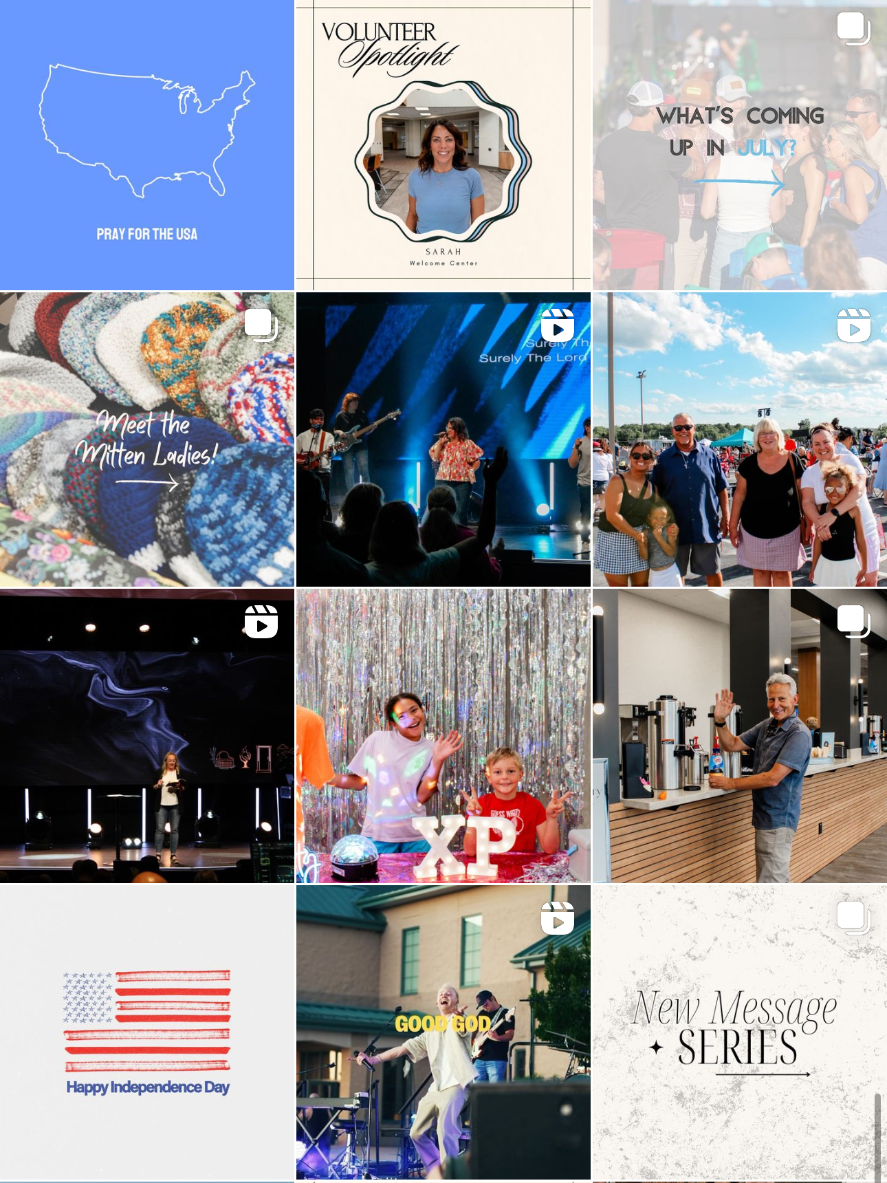
After
In-Depth Post Analysis
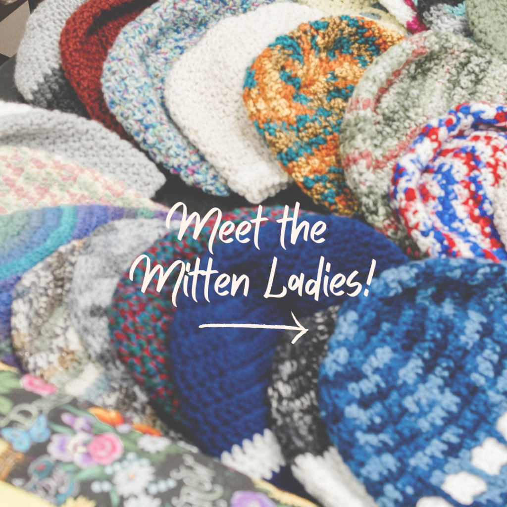
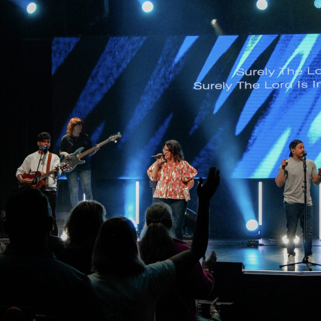
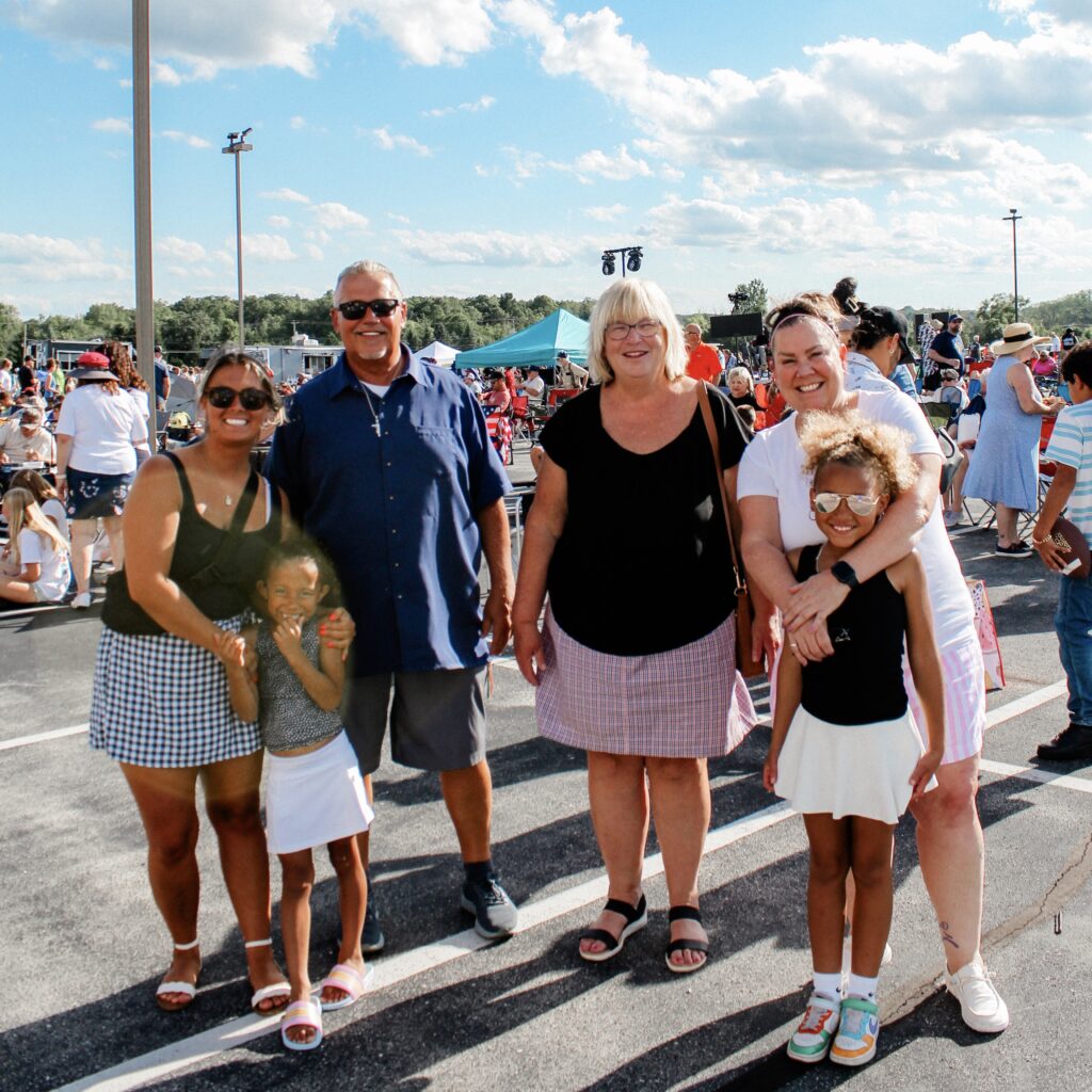
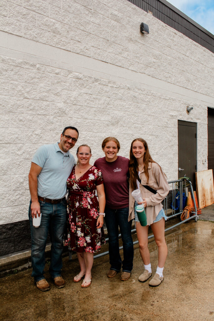
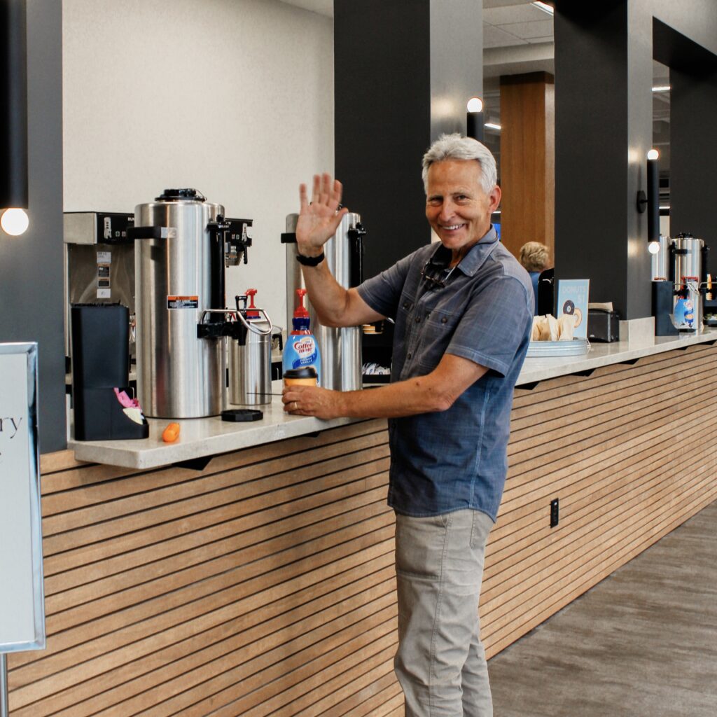
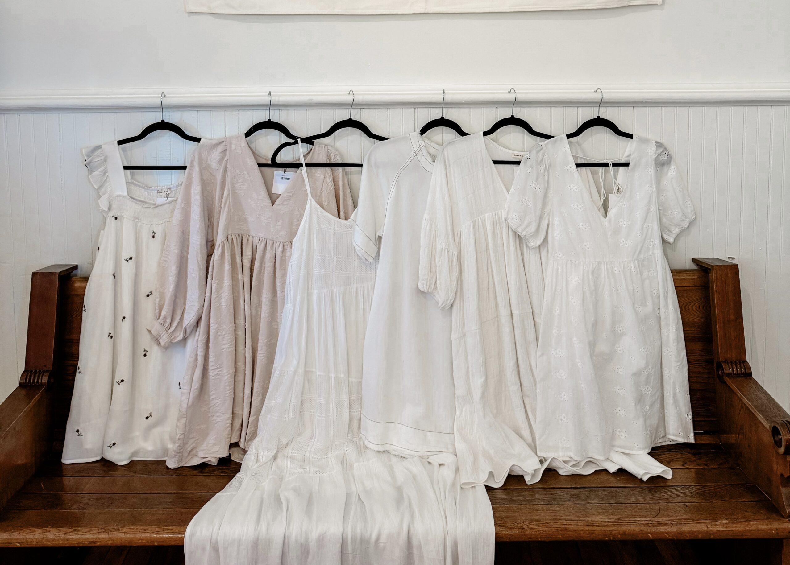
These posts are centered around being relational, rather than informational. The Mitten Ladies post and Volunteer Spotlight are an opportunity for followers to connect with individual members of the church, with the hope that they will recognize another familiar face on the weekend. The other posts are centered around showcasing fun moments from the weekend, with the captions inviting followers to join the next weekend. All of the posts come together to show a story of how beautiful it is when the body of Christ comes together to worship Him. Overall, engagement increased with posts that were less informational and more relational.



The Feather Boutique
This sections showcases the work I did for The Feather Boutique Instagram page.
Before vs After
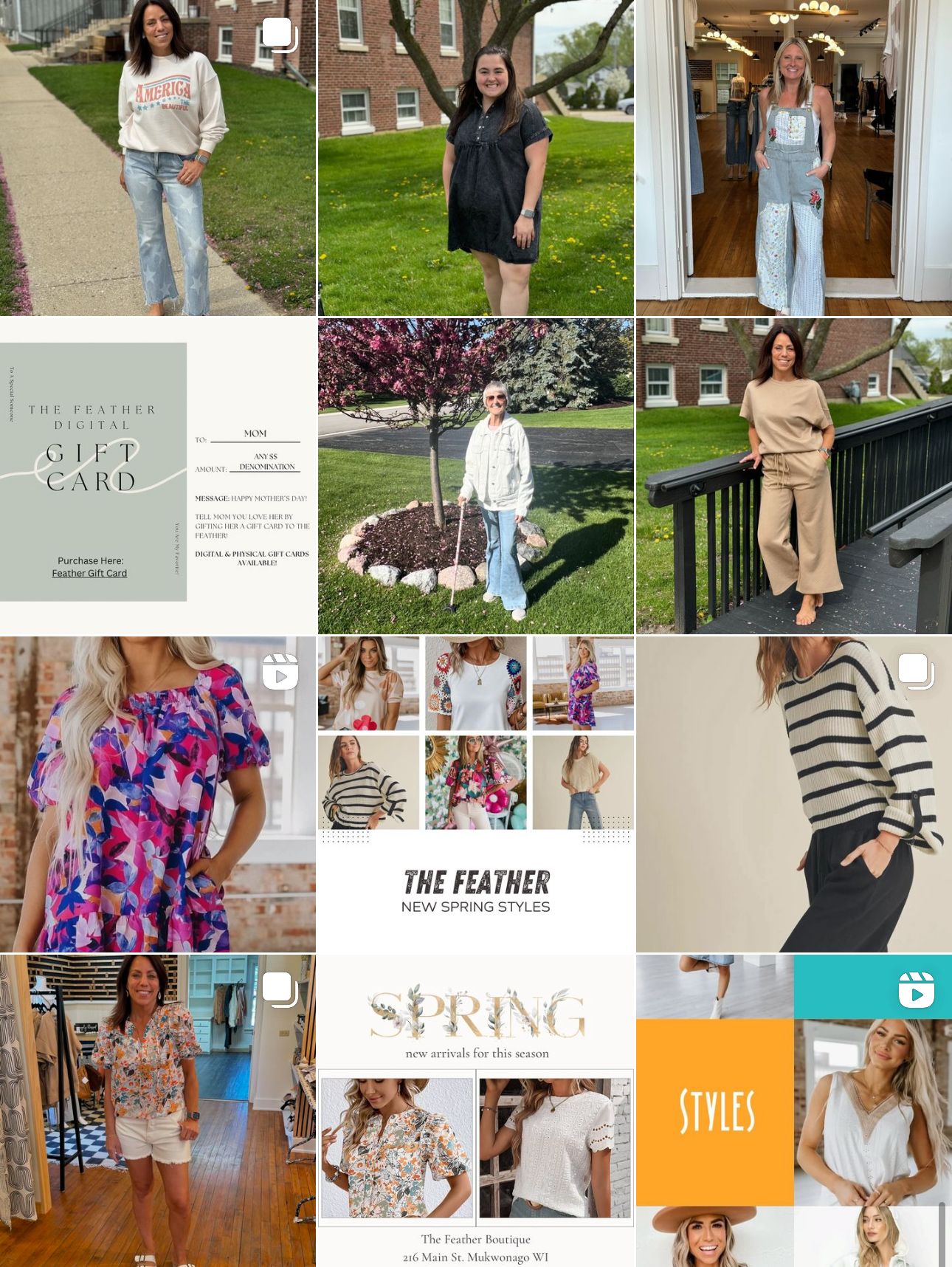
This is a comparison between The Feather Boutique’s Instagram page before and after I started working on it. My main goal was to make the page more unique and personal to the boutique, accomplished by adding more original photos and fun content.
Before
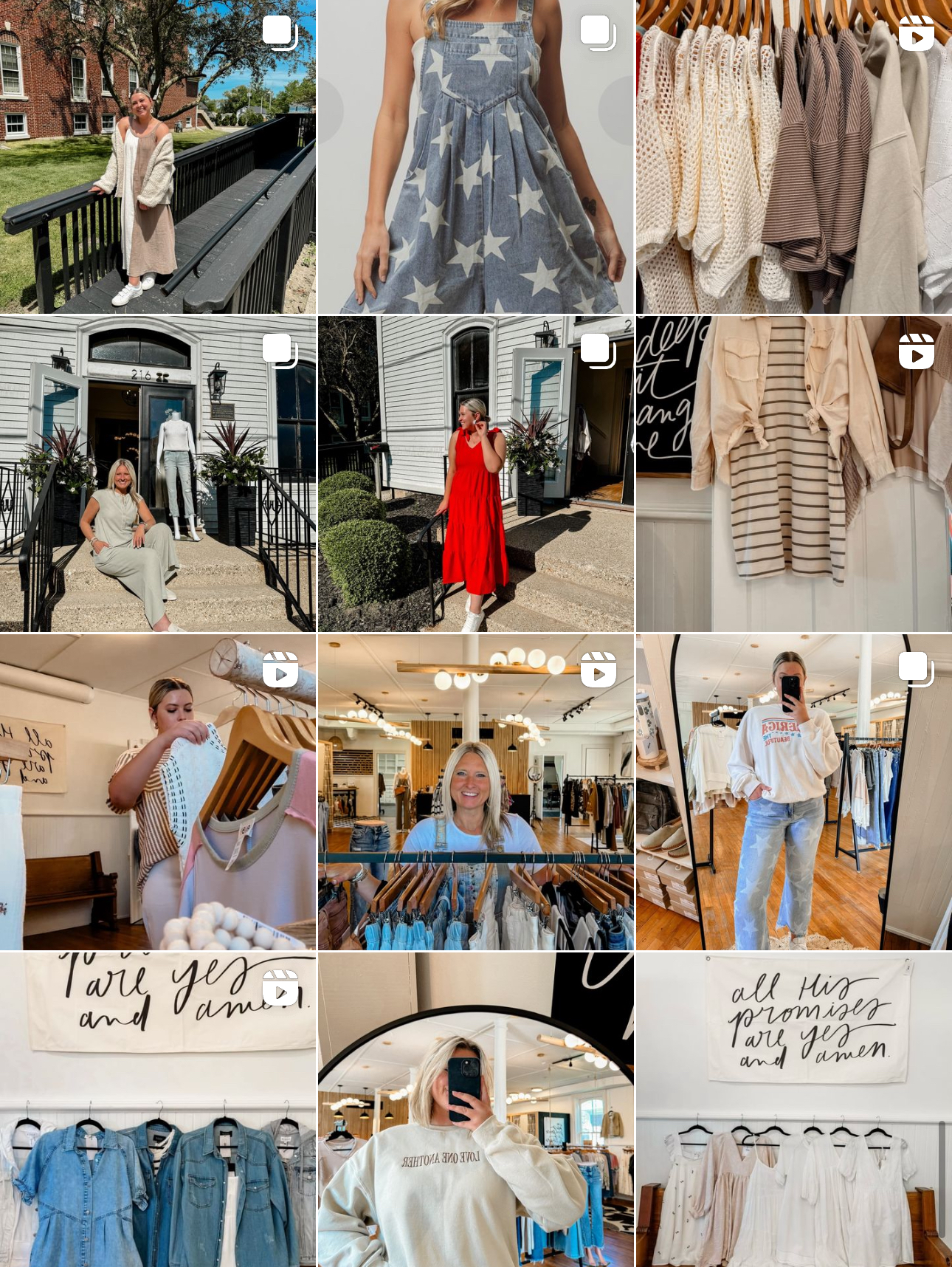
After
In-Depth Post Analysis
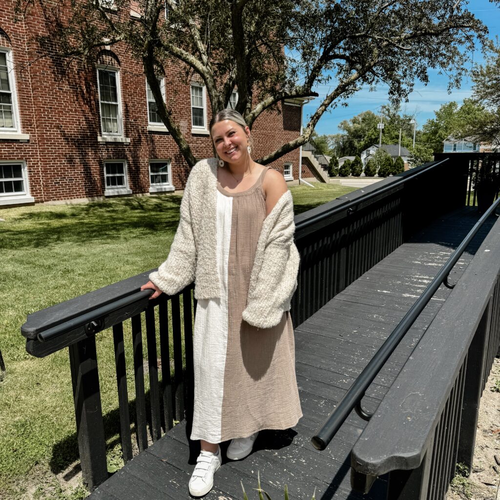
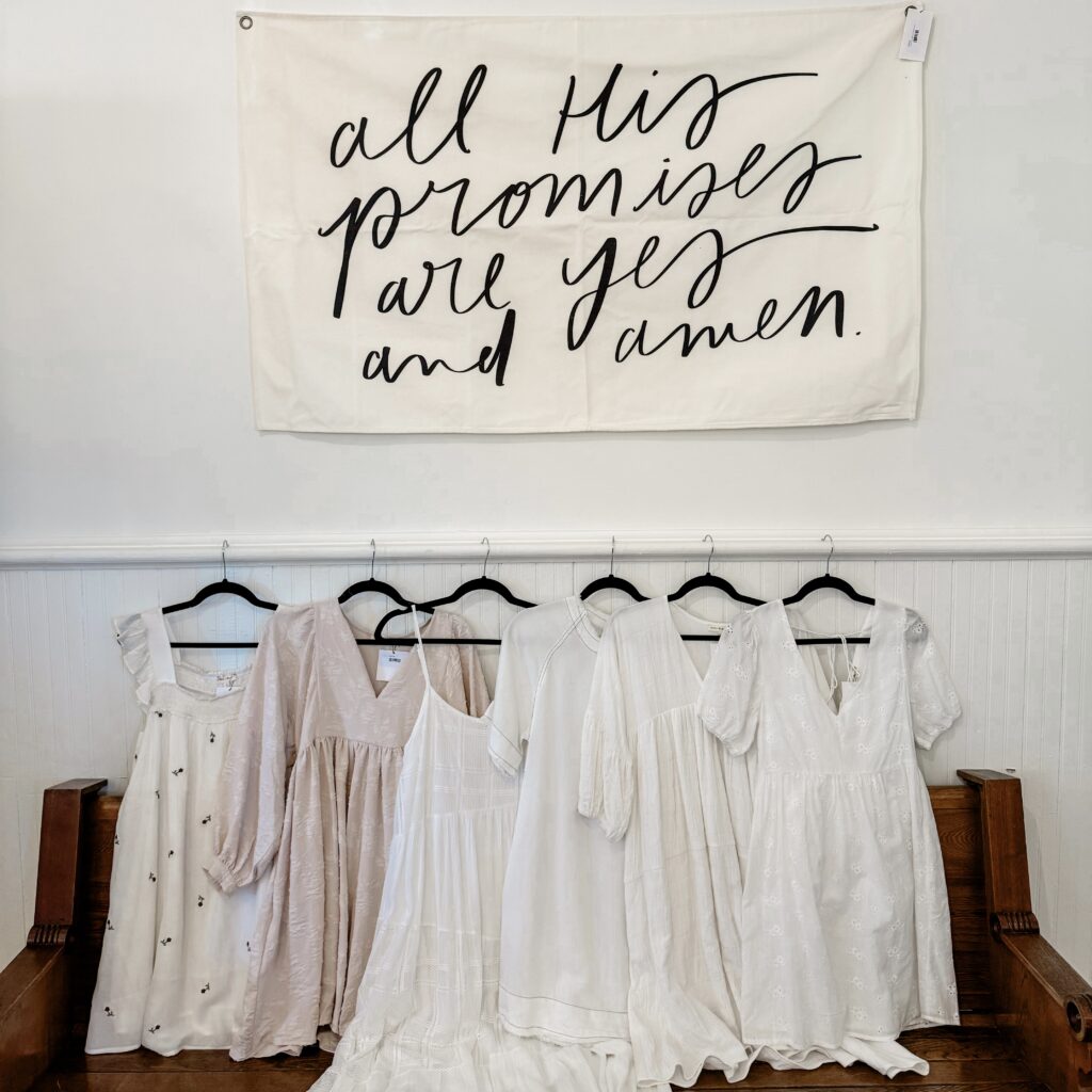
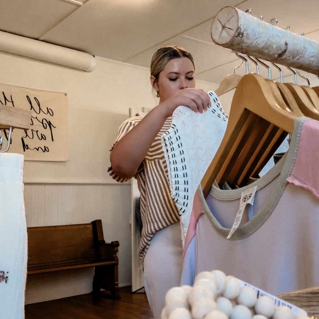
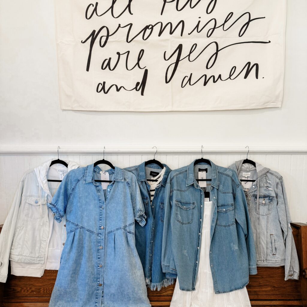
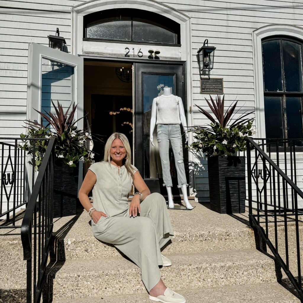
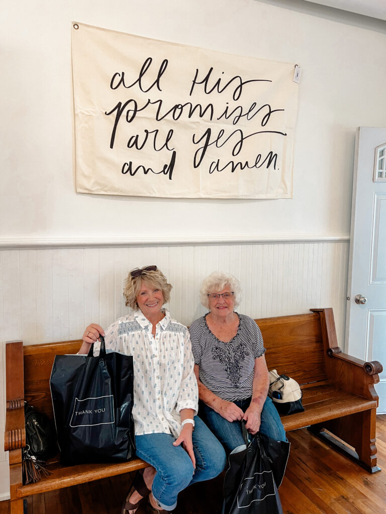
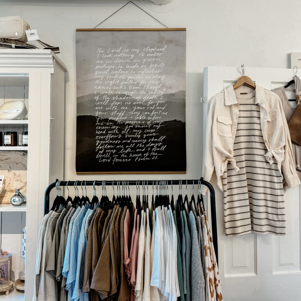
The main goal for these posts was to have original content showcasing the clothes, in addition to unifying the page with the same group of filters. None of the posts pictured to the right were taken from any external site, they were all taken specifically for The Feather Boutique. Each photo showcases a different part of the shop, customers, pieces of clothing, and a unified look with the same Lightroom filter edit. Additionally, the reel focuses on showcasing what it looks like to open the shop on a daily basis. This allows the customers to see a more vulnerable side of the brand that has real employees who care about setting the perfect shopping environment for their customers.
By making these changes, overall, The Feather Boutique comes across as a more personable brand that can relate to their customers.

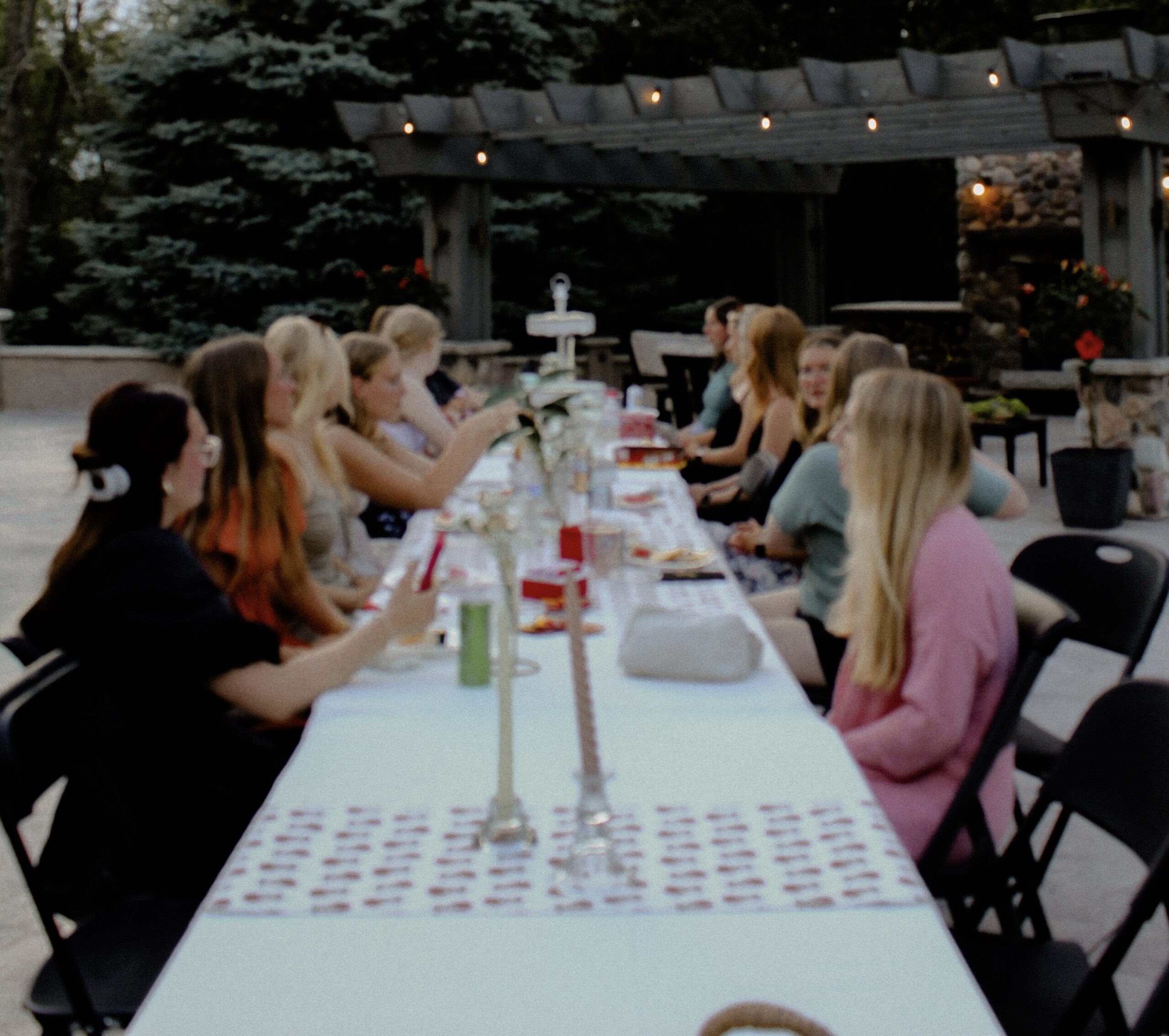
In Good Company
This section showcases the work I did for the In Good Company Instagram page.
Created entirely by me.
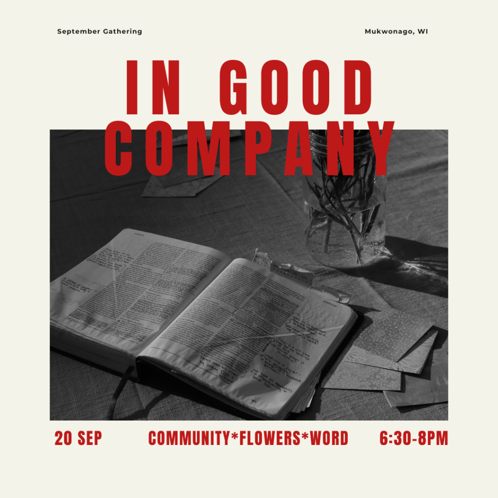
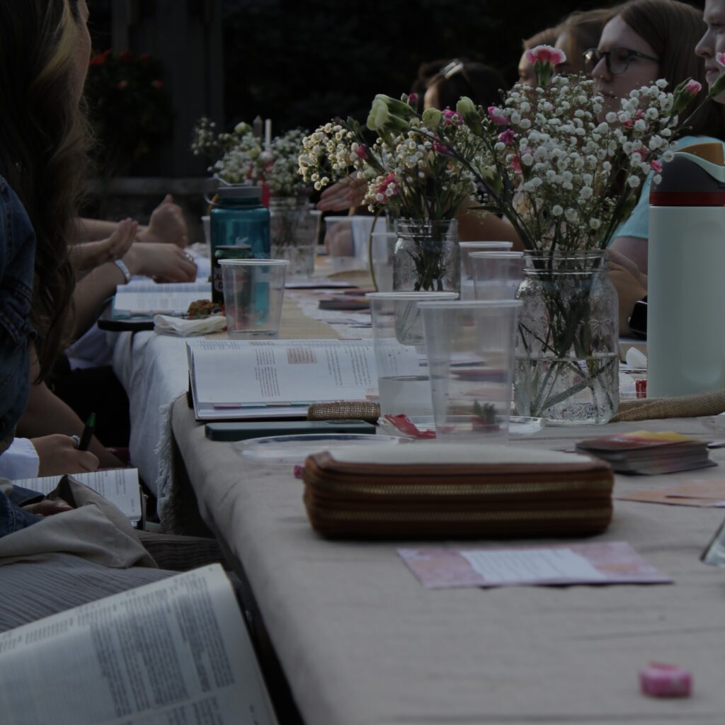
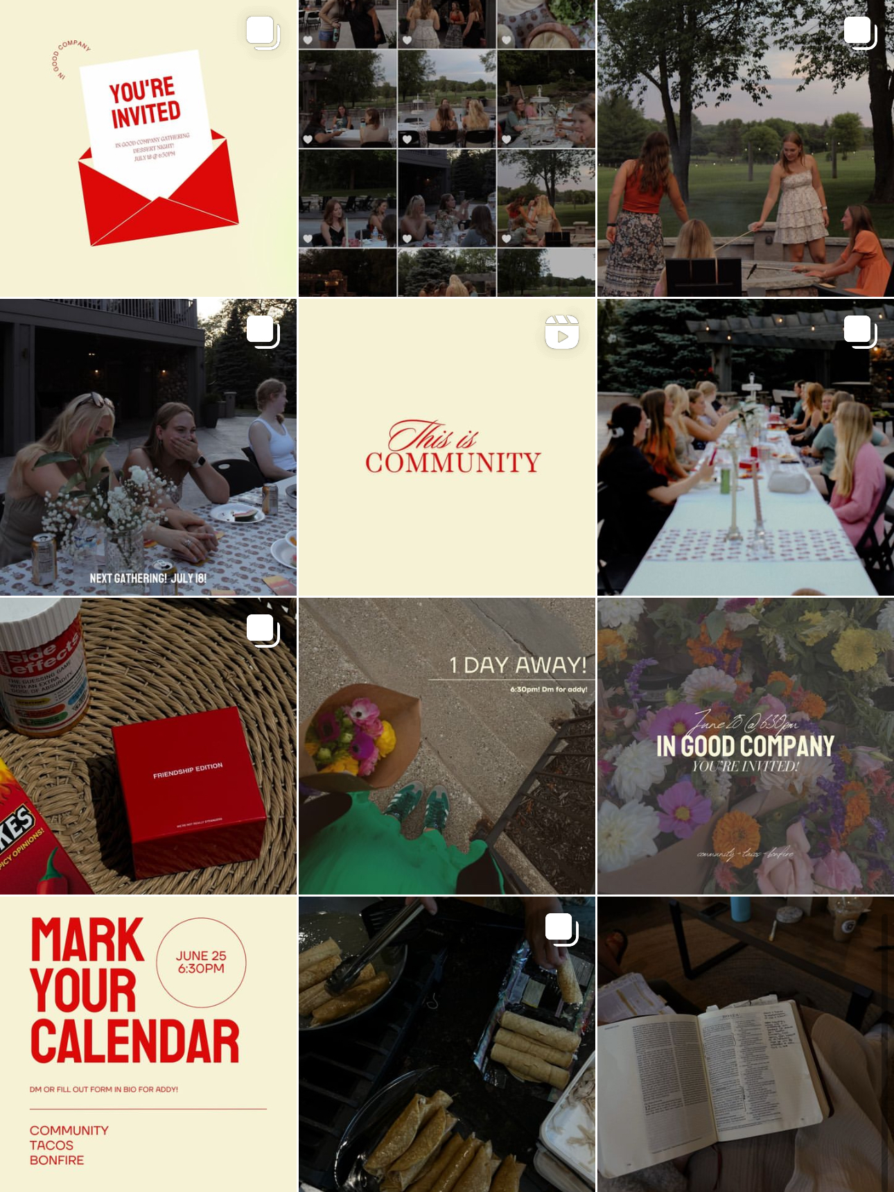
In Good Company is a group that I started in May 2024. Its purpose is to create a space for community to flourish among young adult girls in the Waukesha, WI area. At the gatherings, we dive into the Word, cultivate community, have fruitful discussions, and do a fun activity. Instagram is the main way I put out information and communicate with group members, so I wanted to be intentional about the colors and the way I created the page. I created a simple logo, chose specific branding colors, & aimed to be as consistent as possible throughout the Instagram page.
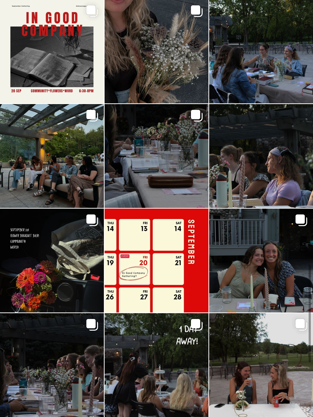
In-Depth Post Analysis
When creating this account, I wanted to focus on two things: brand colors and relatability. I chose to go with a deep red and cream for the brand colors, which are continued throughout the Instagram page. Additionally, reds, pinks, and neutrals are scattered throughout the pictures to help unify the graphics as well. As for relatability, I made sure to have a good balance between graphics, photos of objects, and photos of people. Showcasing the people and stories of the gatherings makes the page much more relatable and personable.


